Essay
Real Life or The Colour of Lemons
Hans Widmer took up studies at Zurich's Kunstgewerbeschule in 1946: at that time, the school was directed by the great Bauhaus master of colour, Johannes Itten. It was an era dealing with the relations between functionalism and art, and between art and the applied arts ; an era developing distinctions between artists, craftspersons and designers ; and one still debating over the links between industry and mass production. History was on the march! "Having arrived in Paris in the hopes of becoming an artist", (1) the young Hans Widmer gradually evolved into a "graphic designer". France may well still have been in the throes of "industrial aesthetics", Zurich by then was clearly distinguishing between art and design which, though not identical, could nonetheless both be attributed to one and the same person, depending on the moment in time, and on the mission such person would be assigned or assign him / herself.
Hans becomes Jean without forfeiting Helvetica
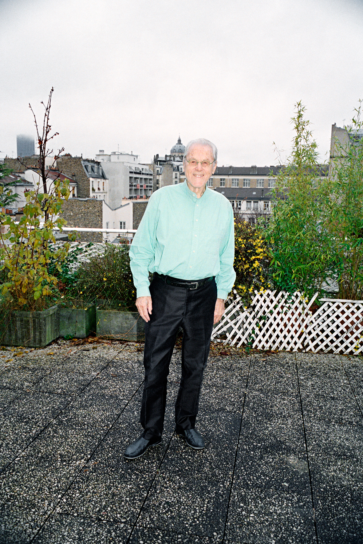
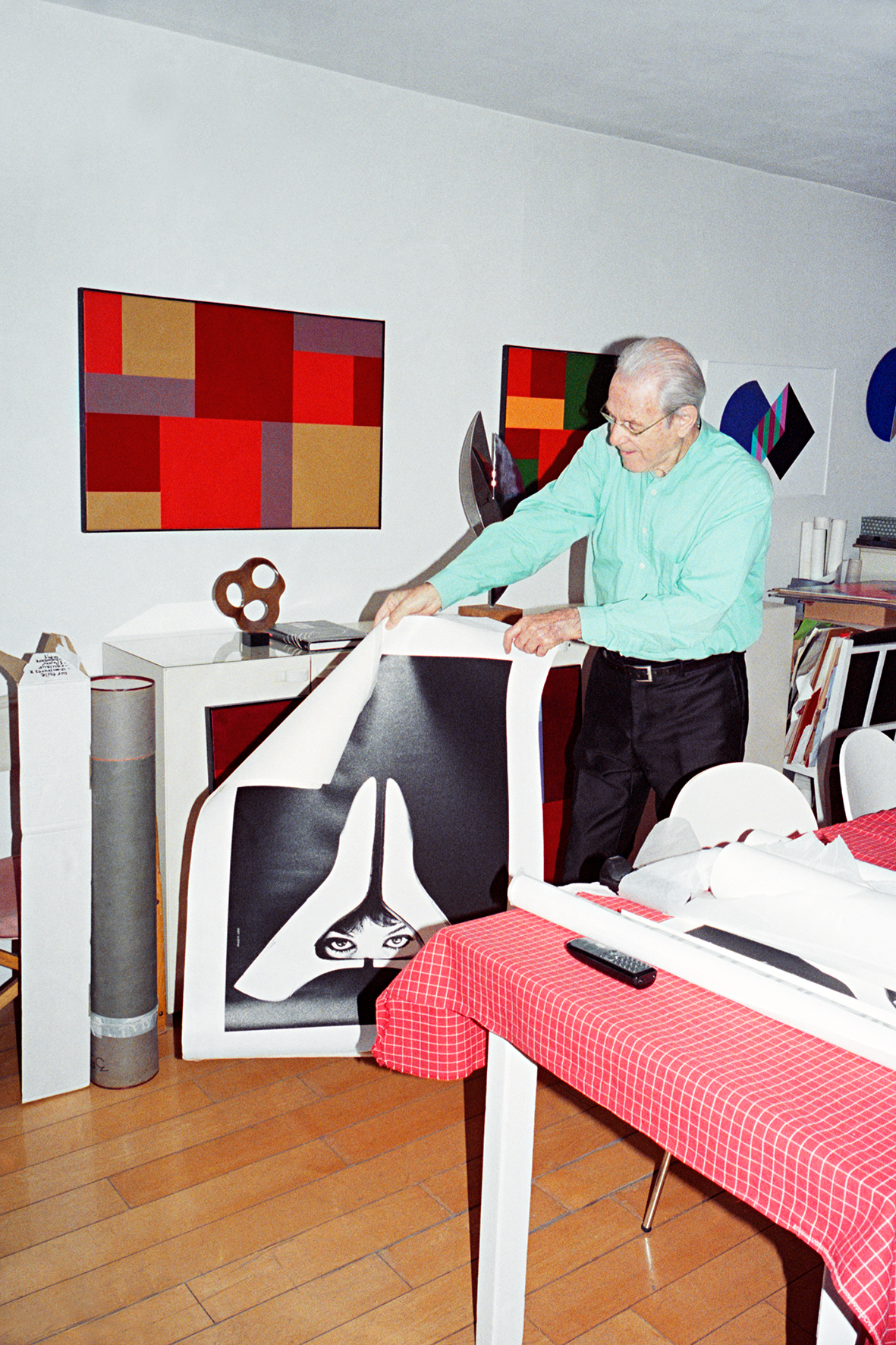
Despite enjoying a fabulous legacy and incomparable training, a person can nonetheless turn into a nitwit for lack of talent, intelligence, grace and a taste for listening to others. Jean Widmer likes to hark back to a saying of his father's: "Knowing how to do and doing [ it ] oneself " - that is, having to do it and never leaving out anything that could widen the world. The long path ahead began with sweet wrappers and gilded coats-of-arms for La Marquise de Sévigné. Jean Widmer proved to be endowed with a sense of hospitality teamed with a sense of humor, enabling him to intimate each person's contribution and receptivity. Indeed, he cultivates the very art of meeting others, and has thus succeeded in surrounding himself with a wider circle of talented and complicit people than the majority of his fellow creators. He discovered his mentor in Fred Schneckenburger, a puppeteer, theater director and great poster collector. Widmer notes : "I was aware of receiving a second education. He became my intellectual guide". Widmer is friends with Peter Knapp, whose role he took over on two occasions. Continuing his studies in New York, he targeted photography and the narrative concept under the masterful artistic director Alexy Brodowitch. He was thus able to assemble certain elements of a creative synthesis. For instance, he noted that each subway stop in Mexico features a unique symbol to guide the illiterate: this would come back to him when he took on the French motorways. Those who have worked with him allude to his unwavering attention. "You're ‘crazy', be it joyously so" Dominique Bozo wrote him; while Margo Rouard underscored his "sharp gaze and slow gesture", and also paid tribute to his "gentle stubbornness". Personally, I like his way of saying: "It's the combination of a healthy Swiss education and the ‘French spirit' that greatly stimulated me". And it is indeed the "combination" that heightens taste and introduces an ever present bass note, a breakaway through which the spirit of the times and imagination provide the rules of the game. Itten saw the colour of lemons as passing through the body: he was wont to ask his students to eat a lemon before describing and studying it. And so should it be for any deliberation about reality: (2) What is its pathway and what are its colours ?
The ecologist of imagery
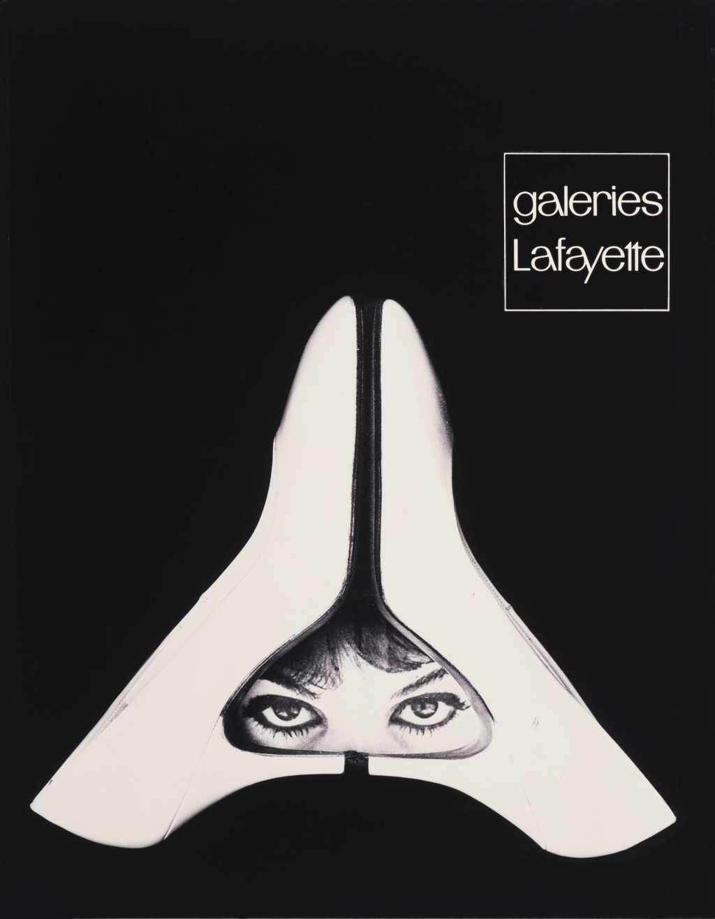
From 1955 to 1969, Widmer's life took on a propaedeutic bent. Having been entrusted by Jacques de Pindray with directing the agency, Widmer began carving out his territory. He took to giving pride of place to photos of the body in motion; with Korrigan and his logo he came up with the first visual identity. He also proved to have an eye for emerging talents. While at the helm for Galeries Lafayette, he sought to "free the Parisian temple from the canonical merchandise", to reject publicity featuring the object and the price, to impose the collection idea by creating "atmospheric images". Sadly, some very handsome adverts fell to the side for "failing to meet customer expectations"! Freedom began making headway for him with the Le Jardin des Modes fashion magazine, which veered from women's knitwear to the playful modernism of a woman's magazine - wittily informing and surprising its readers. Widmer became the mag's photographer, sending out invitations to those who most promised to imbue the subject with atmosphere. Fulfilling a wish made of him by Jacques Admet, director of the ENSAD (the prestigious public university of art and design in Paris), as of 1960 he set up a graphic arts department. He would go on to hone this project until 1996, establishing a core curriculum for which he assembled a team (including a large Swiss contingent) to teach the graphic arts professions. The project ended up as a "Department of Visual Communication". He thus combined the game rules with the game: that is, "objective teaching" at school with his own creation through his agency.
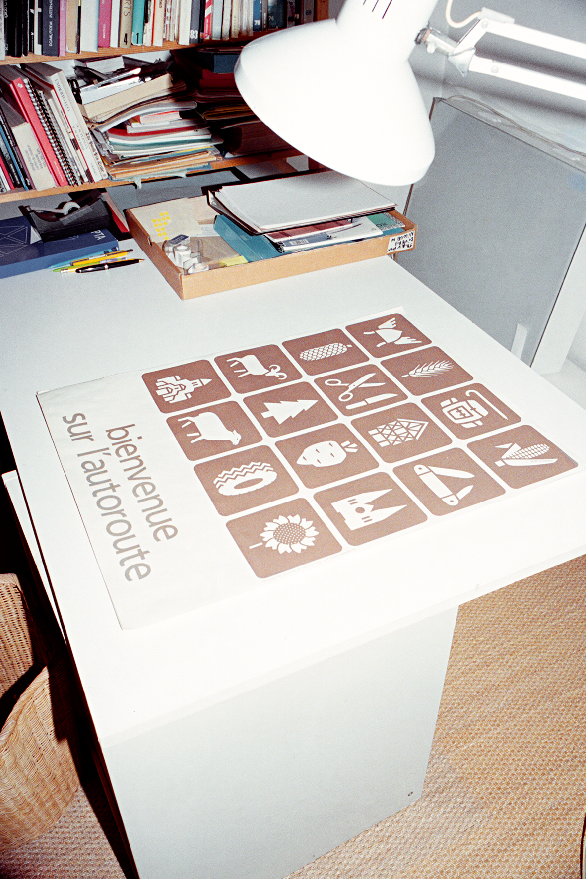
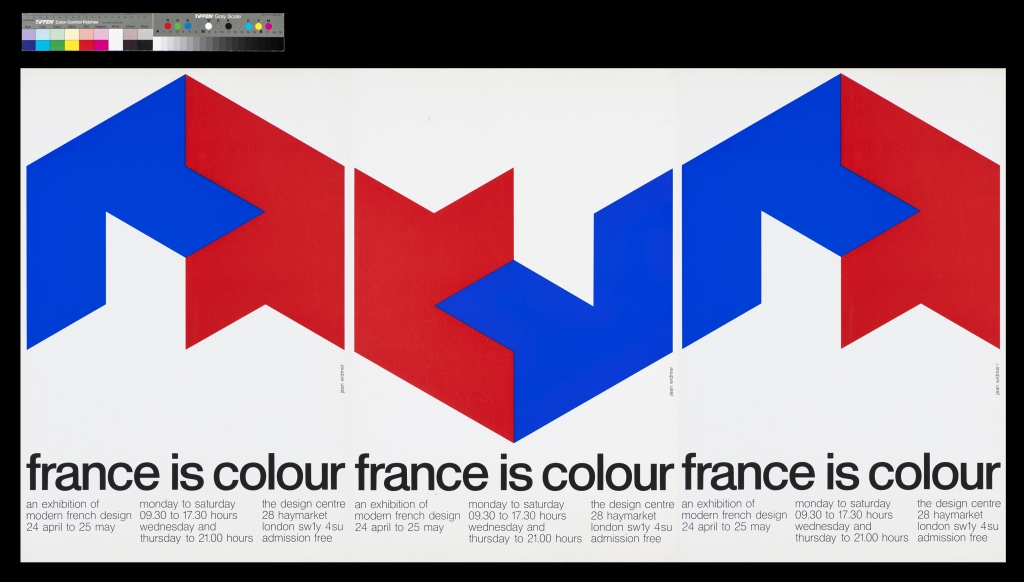
Forgive me for inserting a personal note here. It was in October 1969 that, upon my suggestion, a Centre for Industrial Creation (the CCI) was opened within the Museum of Decorative Arts. At that point I knew Widmer personally and I admired his work. In June 1969, I asked him to design, together with his students, twenty-one posters for the Centre. He did so on his own (the students were on holiday break) and most rapidly. It is the best gift anyone ever made to me. The project's minimalist graphic design avoids depicting the object on display. Viewers are given an overall identity, a pleasure for both the eyes and the mind. I cannot claim to be objective, but to me those posters represent the apex of graphic expression. From that time on, a phase of Widmer's mature output can be traced. For instance, after seeing Widmer's CCI posters, the Motorway Societies architect contacted Widmer. The latter set to work immediately, slowly creating first the forms, then their essence, their purification, their pictogram... The birth of a universal model. Hiestand and Widmer teamed up, going on to win the Centre Pompidou's international competition for its own visual identity and signage in 1974. Theirs was a masterful lesson in the field, harmonising the totality of active factors by duly involving the diversity of departments (colour coding), the fluidity of the traffic flow and indications of location (original typeface by Adrian Frutiger, vertical reading of the panels - a verticality alas never duly respected) to ensure spatial exactitude and greatest fluidity. The project underscores the architecture with a superb and internationally acknowledged logo created by Jean Widmer. Later ( in 2000 ), a new president of the institution sought to stamp his own trademark on the museum by seeking to do away with that logo. However, his intention came to naught thanks to a flurry of petitions and protestations. Widmer's acclaim was further asserted thanks to his work for the Musée d'Orsay, the Jeu de Paume Museum, the Institut du Monde arabe, the Library of France, the National Natural History Museum, the City of Berlin. In short, Widmer makes history! The scope of his portfolio expanded to include public utility projects, prompting him to assert : " Relations with a strictly mercantile world do not interest me ". Images need to be lasting, to contribute to consistency rather than appearances. They belong to a whole forming a language and an identity. As composite units, they entail both meaning and discernment, use and economy, time and space. Transmittable, they can be received by each and everyone. Text and image unite into a "successful concept" based on research and design. "The shape of simplicity" takes time to attain. Less is more. And a healthy dose of energy is required to impress upon clients the need for such time, such withdrawals, in order to attain the right note. "Often a graphic designer will ask of his client: ‘What is it that you want?' That's a question I don't want to hear".
Over these many years, Widmer has created images that are meaningful, bowing to reason and insisting on producing an aesthetic, and an "artistic" mastery that is induced and thus never decorative. He has drawn on the living Bauhaus and de Stijl sources to develop his own mode of expression. Never has he ceased to paint and "build" a neo-plastic art through his choice of shapes and colours. Presently, he uses drawing to address the third dimension, creating sculptures that envelope and shape space. A designer, a graphic artist and a visual artist: he is all and each of these.
François Barré
Translation: Margie Mounier
(1) Unless otherwise indicated, the quotes stem from Jean Widmer's discussion with Margo Rouard during the Jean Widmer, graphiste, un écologiste de l'image, 1995 show at the Centre Pompidou.
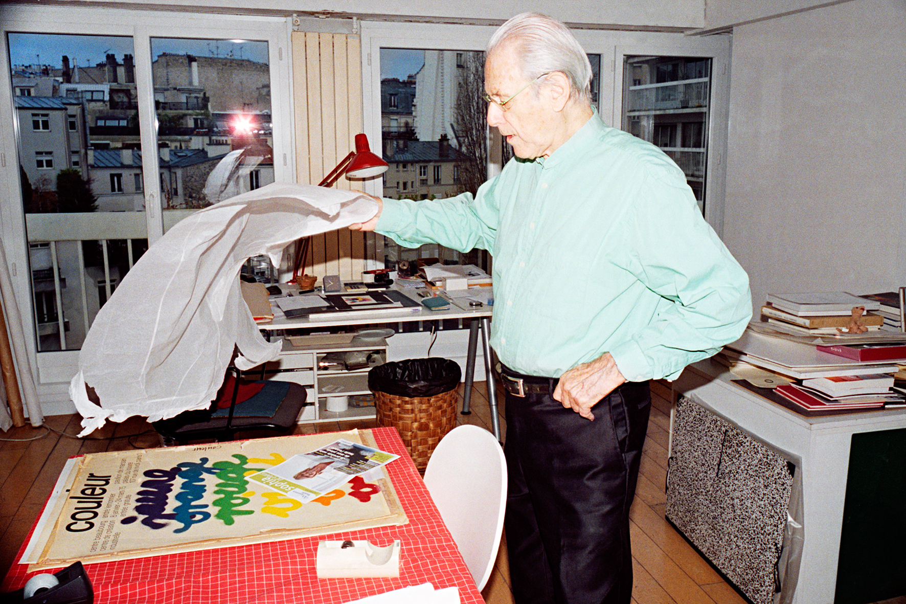
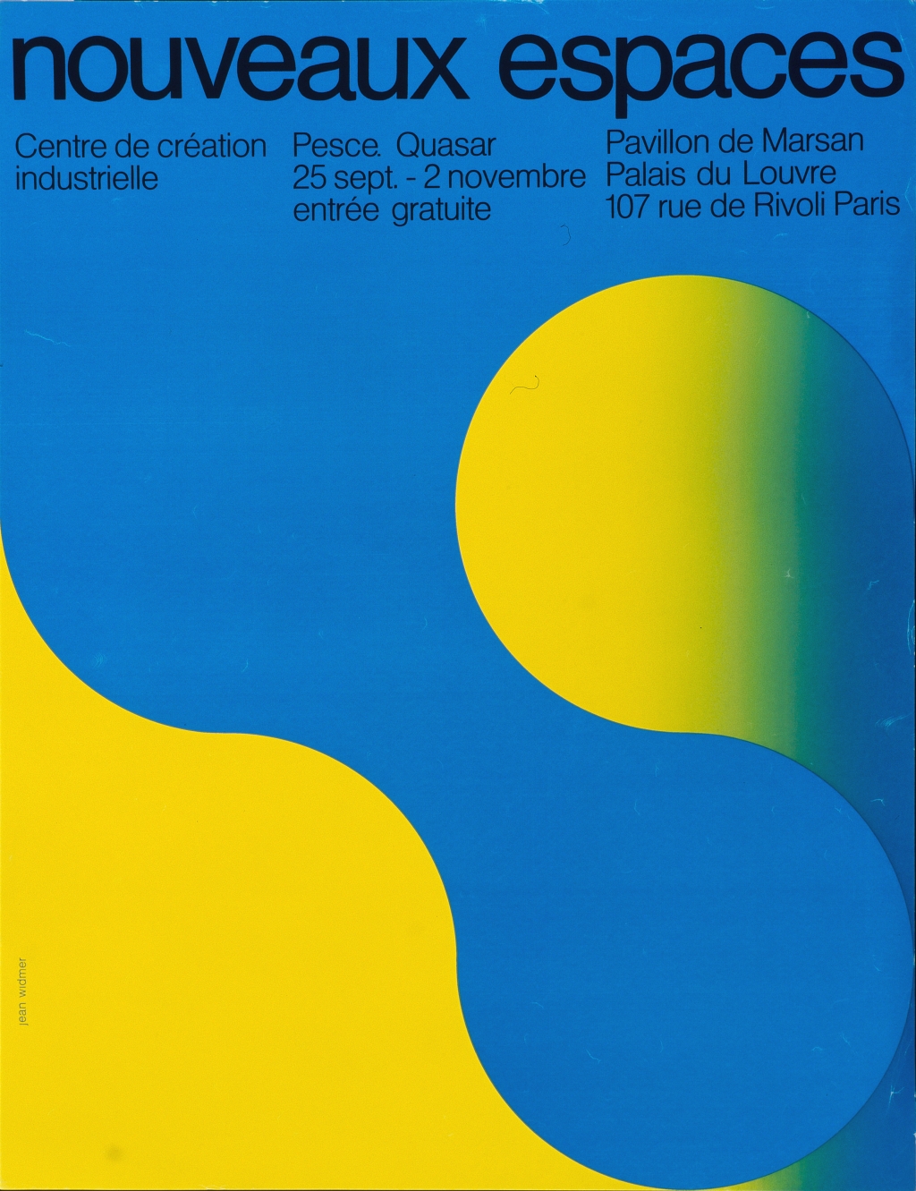
(2) The CCI poster that Jean Widmer designed for the 1975 exhibition Couleur shows yellow in violet, orange in blue and violet in yellow.