Awarded
Rafael Koch
Small printed matter
Graphic Design
small printed matter
© BAK / Erwan Frotin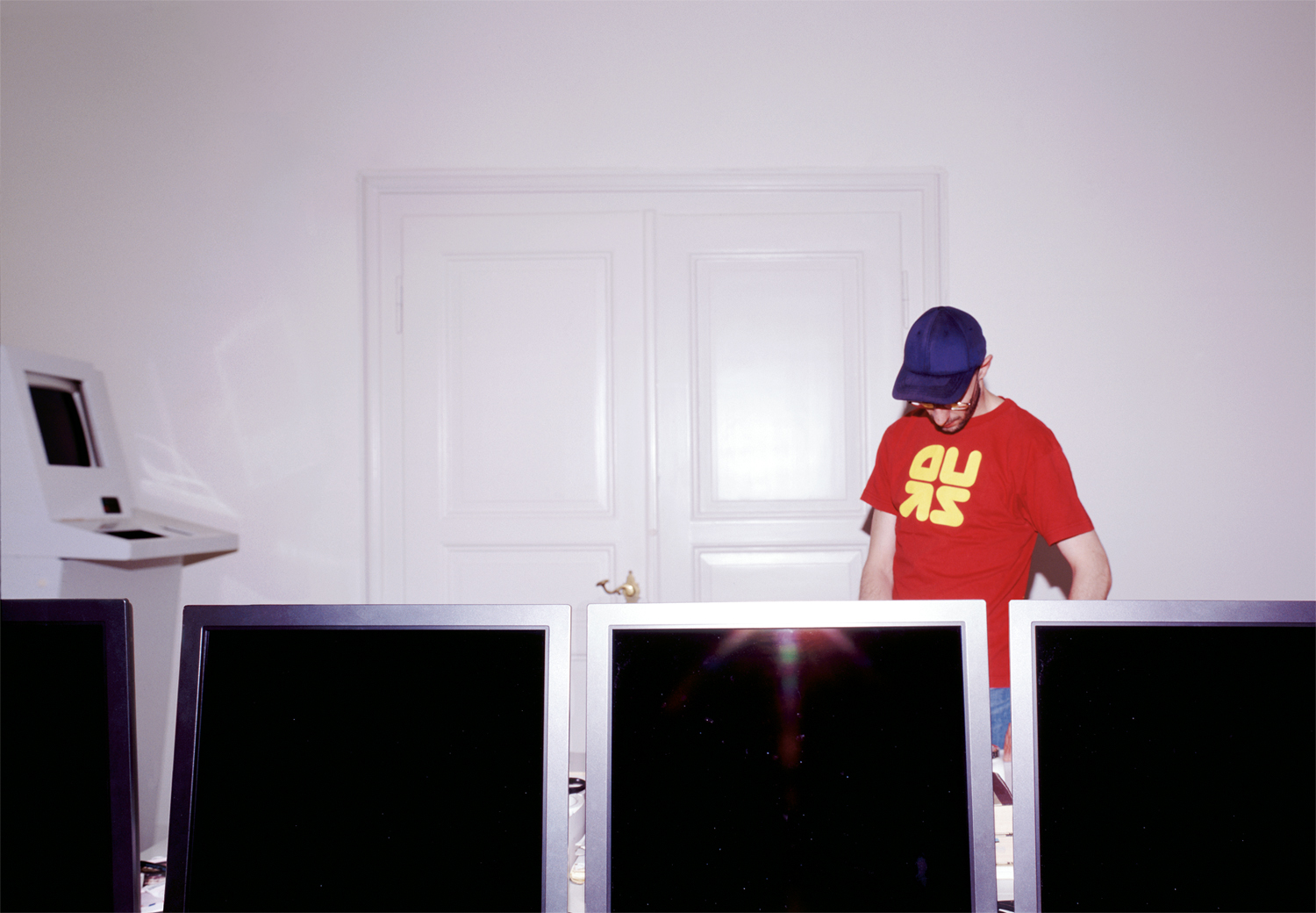
Rafael Koch in his studio
© BAK / Körner Union, LausanneAwarded
Small printed matter
Graphic Design
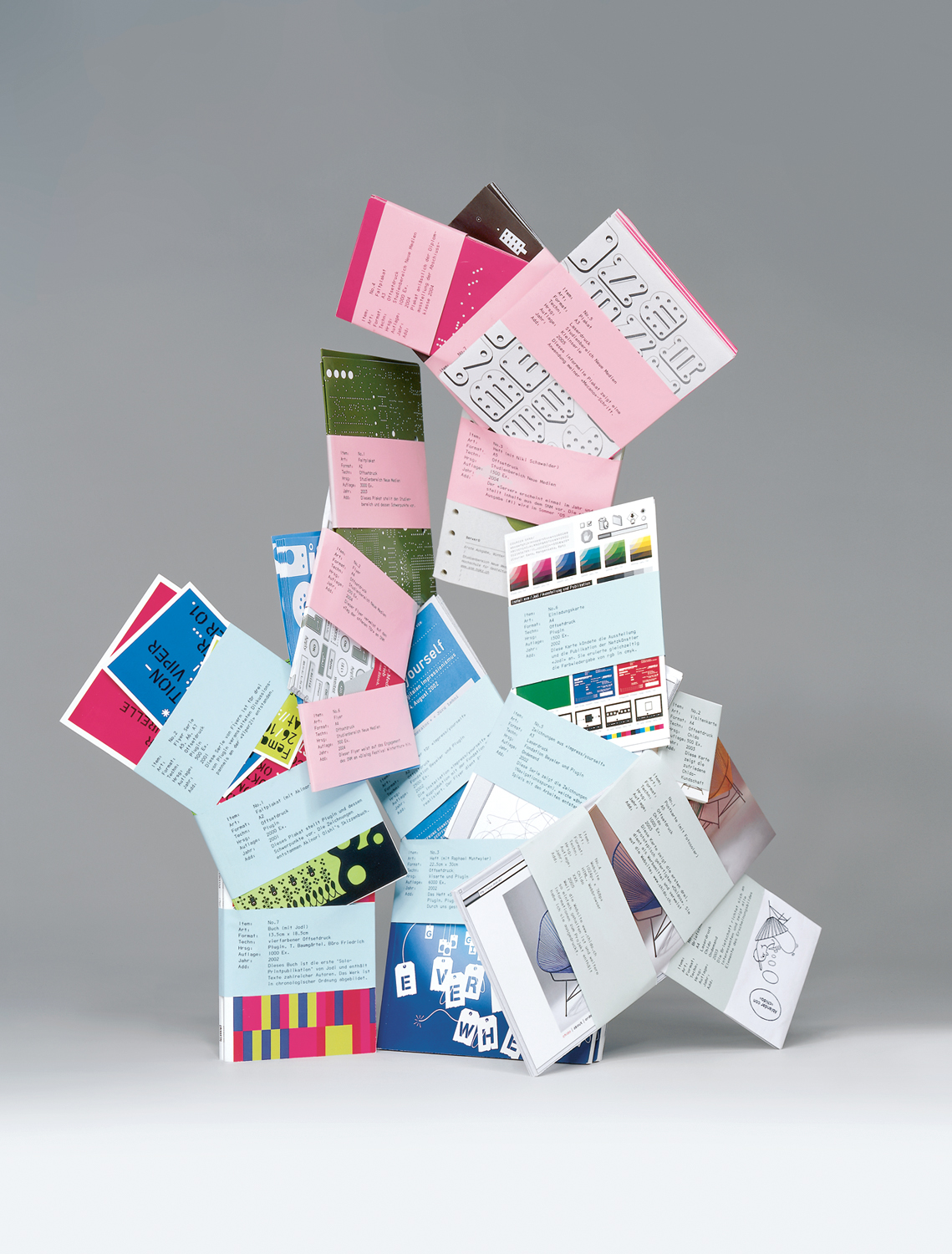
Circuit board and Stoky construction kit
How can New Media be advertised? The Lucerne designer Rafael Koch answers this question with the highly individual graphics he has realized for clients in the world of New Media. But what does his printed material look like, aimed at a specialist (and presumably very young) audience that is interested in New Media and probably gets most of its information via the digital media? The New Media course at the Hochschule für Gestaltung und Kunst Zürich (HGKZ) promotes itself with a leaflet that is more confusing than informative at a first glance. A welter of punched-out white dots can be seen against an olive-green background, as though you are looking at a circuit board in a computer. But there is a system behind all this confusion: the eye soon makes it out, as it can soon convert all the dots back into writing. So anyone who is being addressed by this graphic work should not be afraid of excess. Rafael Koch skillfully translated digital phenomena into analogue images for the HGKZ from 2003 to 2005. He has successfully used keyboard symbols as well as the circuit board, or Stoky metal construction components, which were adroitly translated into an alphabet.
Rafael Koch has also designed printed matter for the Basel New Media centre [Plug.in], and this too has a high level of independent identity. All Koch's flyers share the 'all over' technique, which does not leave a single square centimetre unused. A metaphor for the fear of emptiness in today's media age? Koch's sensual analogies for digital matter are convincing, and prove that for once elegant reduction can be replaced with playful over-stimulation. Excess, not implying visual chaos, but efficiently directed at a tightly focused audience who know how to handle this visual language.
Peter Stohler
Rafael Koch
Born in
1976
Education
Grafiker