logorrhea
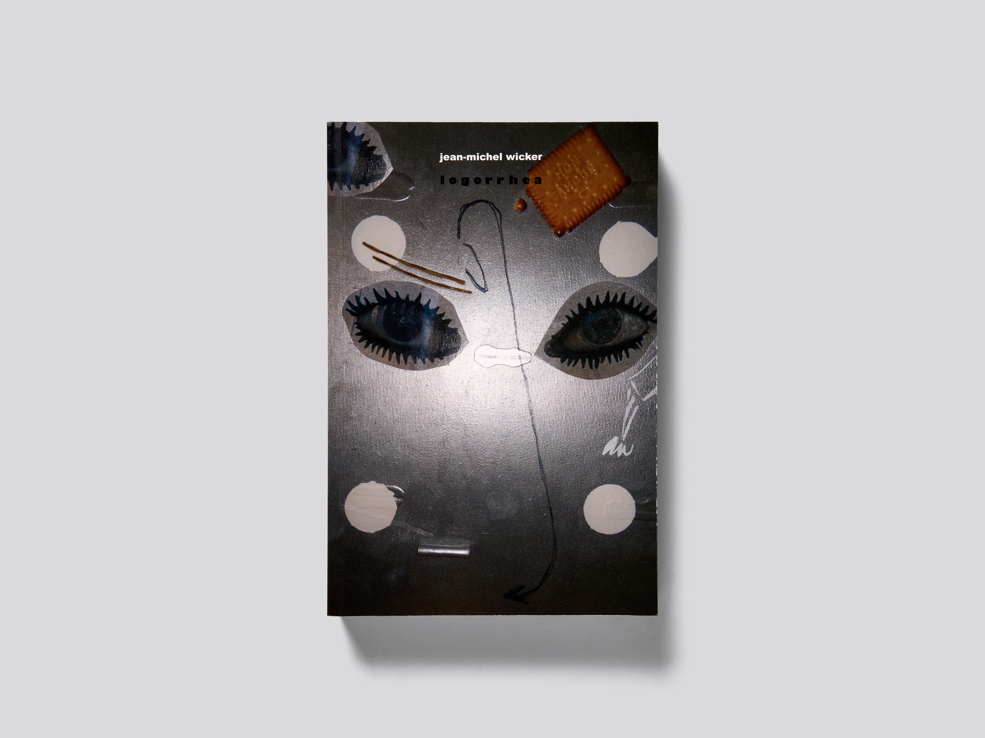
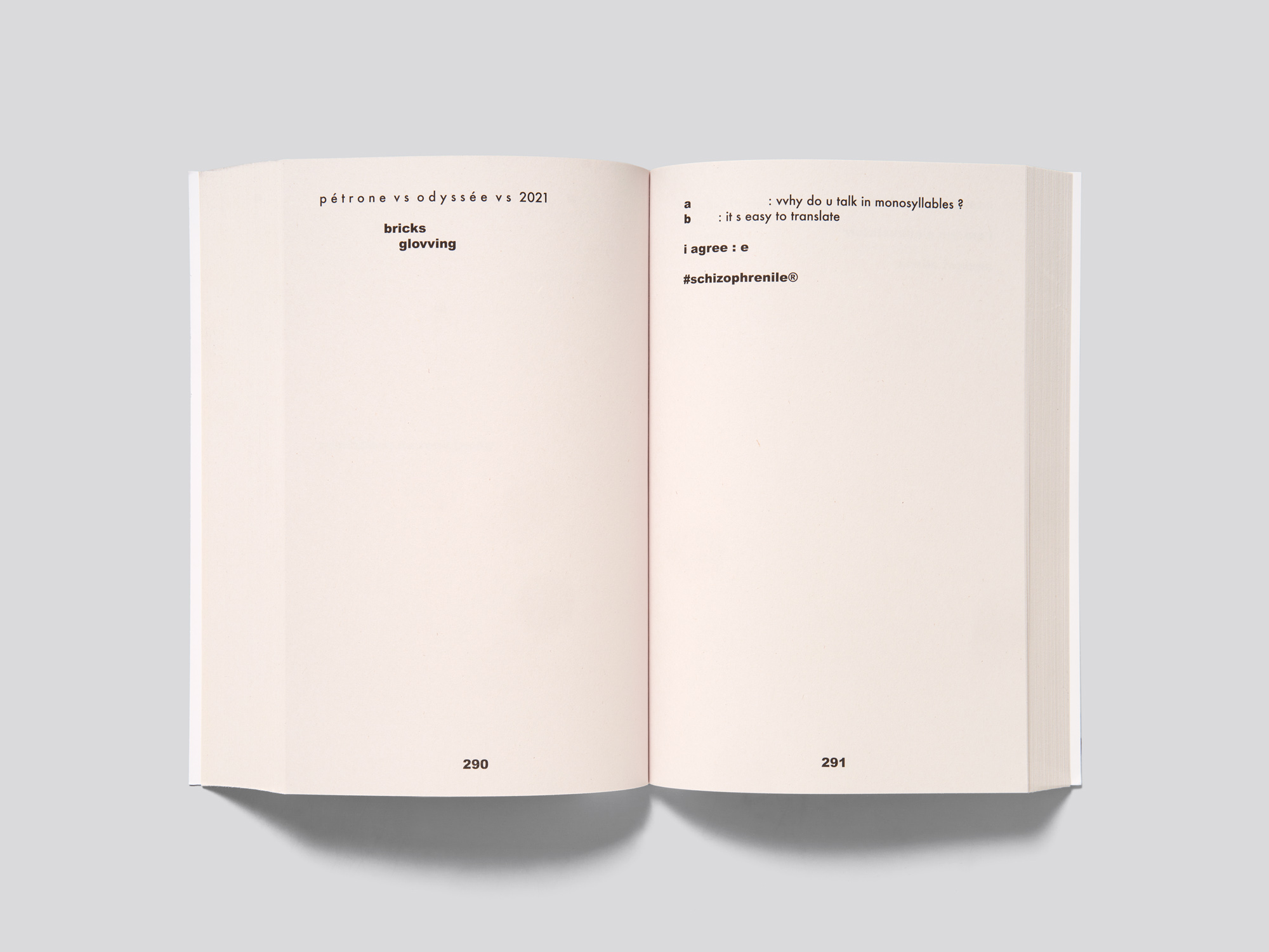
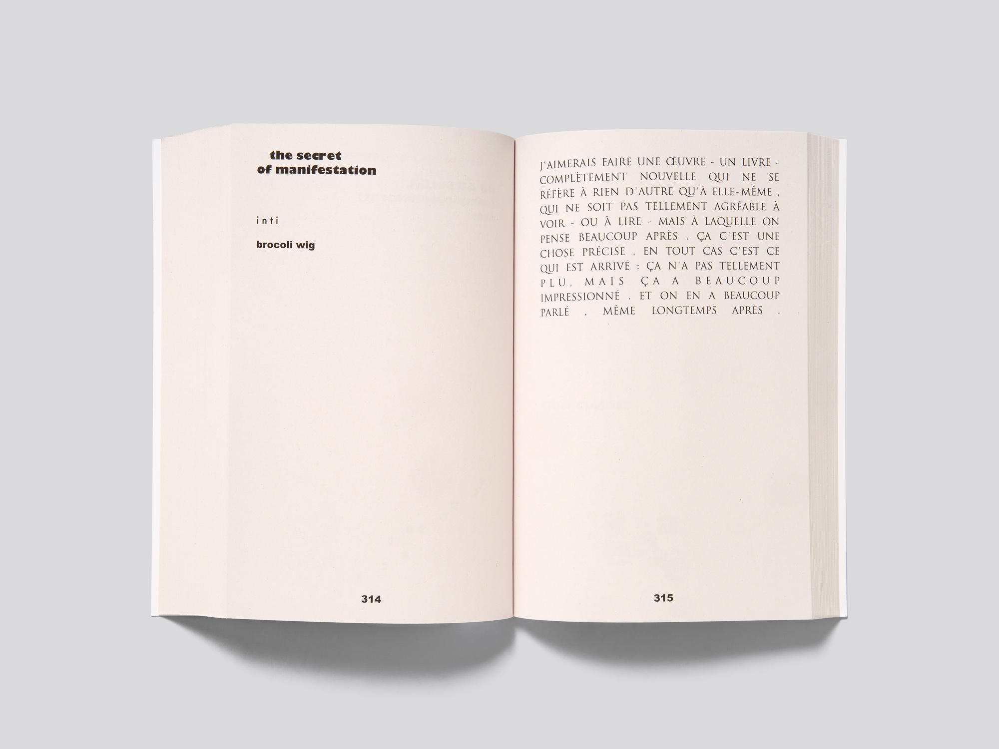
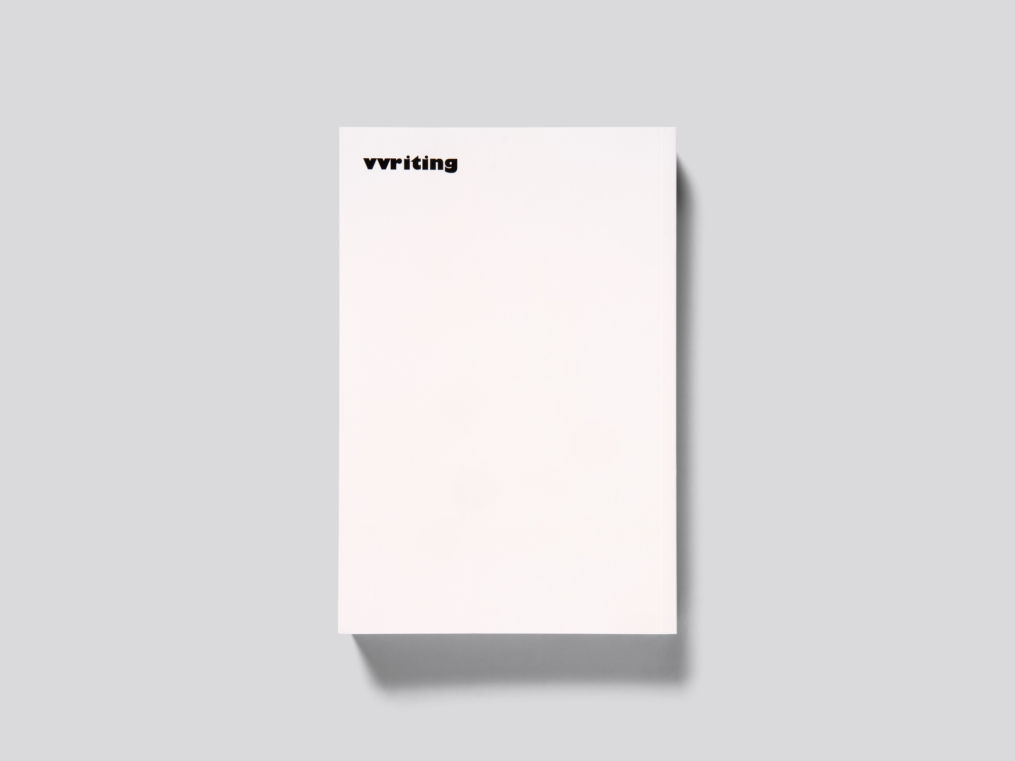
Realised in close collaboration with the designer, an artist’s book focusing on the written word in Jean-Michel Wicker’s work becomes a harmonious object in which words, fonts and typography work closely together. At first glance it looks like an inexpensive paperback – a laminated cover, a collage on the front and 466 black-and-white pages on thick but lightweight recycled paper. Yet the inside of the cover and the half-title subvert these expectations – another collage, featuring a few tiny e’s, is found on the left-hand page, and a giant black e is on the right. An introductory essay is mostly set in a serif font, but a few words and sentences in Gill Sans Bold stand out. The bold Gill is then used as the main font throughout the book in which short notes or isolated sentences appear alone on a page, often at the top of the print space, but occasionally freely positioned. There is a lot of white space throughout, and some pages and spreads are left completely blank except for the page number. The unconventional orthography is strongly orientated on pronunciation, underlined by typographical quirks such as the use of ‘vv’ in place of ‘w’. As the book progresses design variations increase: a page printed in fluorescent yellow, decorative fonts and doodles, inverted letters and a few drawings. The typography often reflects the humour of the texts, but it is not overly dynamic, allowing all the words and text compositions to speak for themselves. The work successfully plays with the traditional visuals and design idioms of a text book.