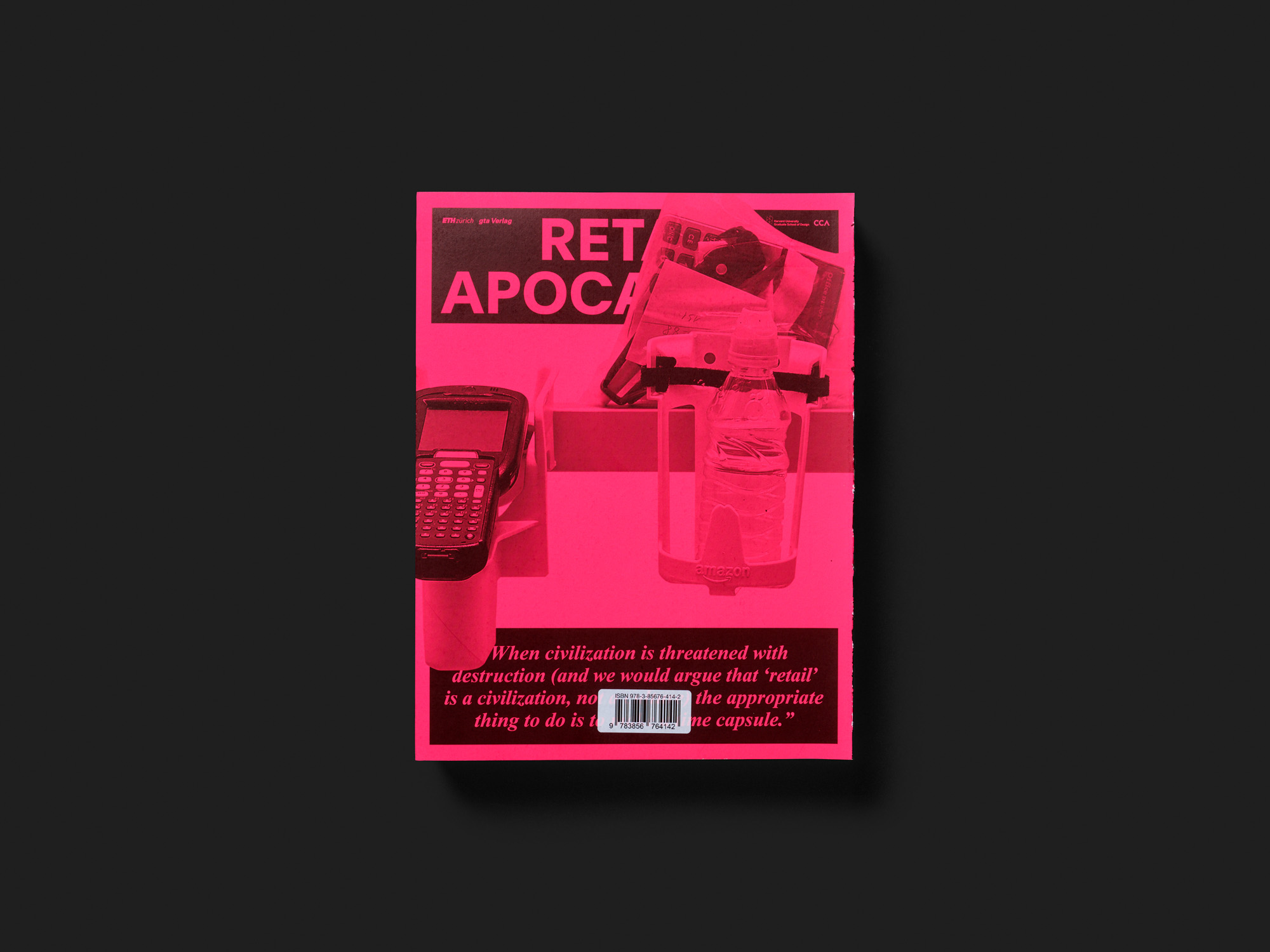
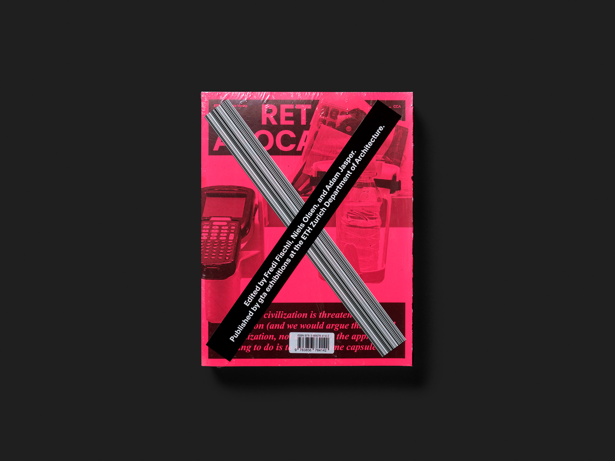
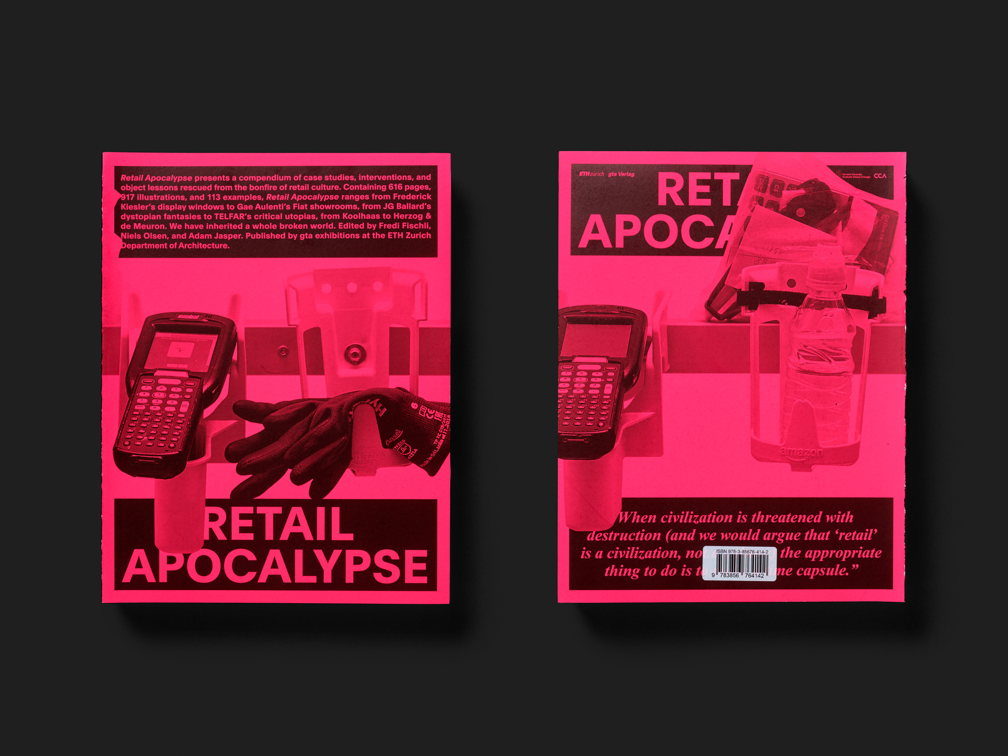
RETAIL APOCALYPSE
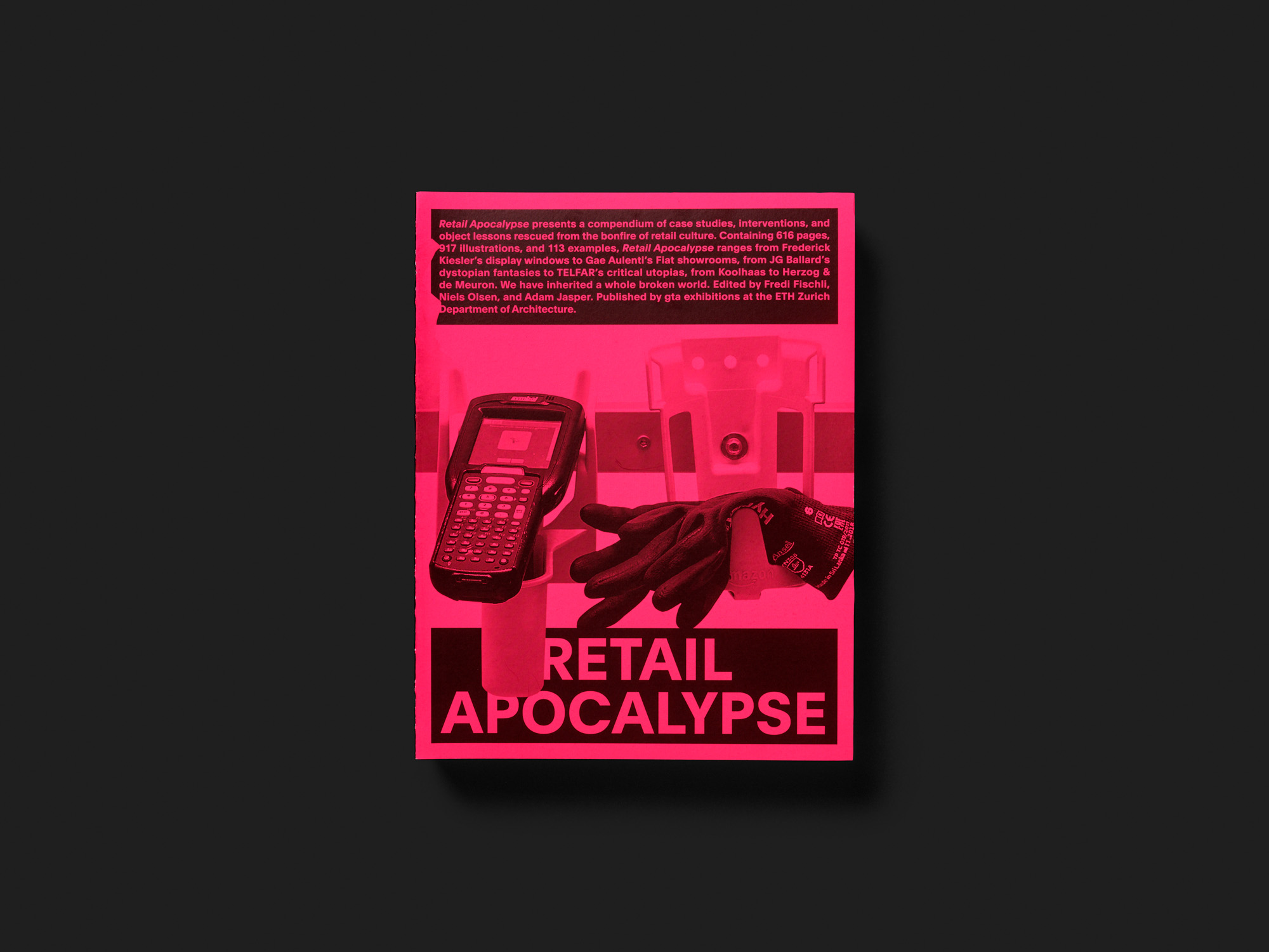
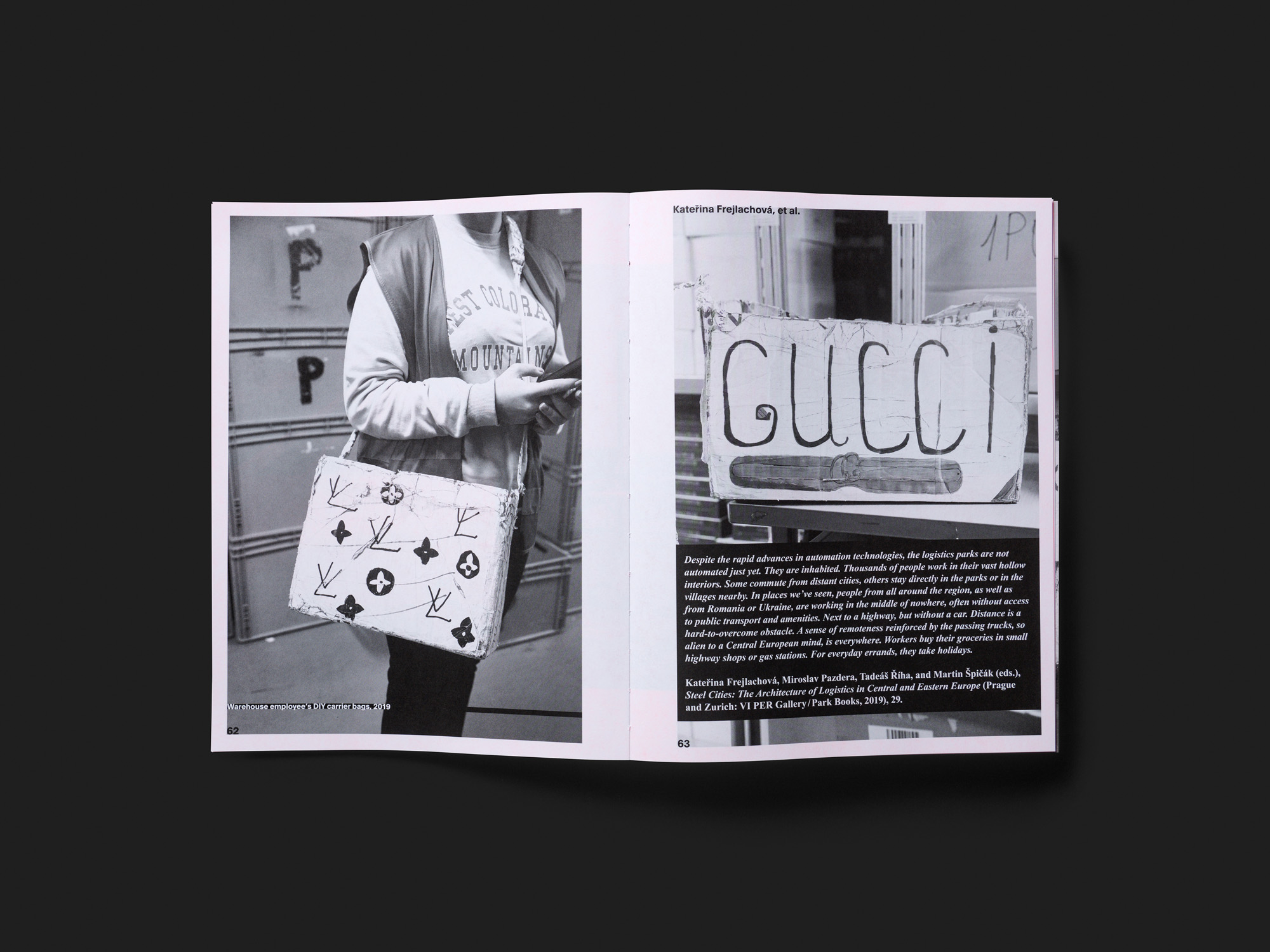
A heavy 600-page volume documenting the decline of the retail trade from the perspective of architectural theory is based on a compellingly simple yet efficient design idea: the paper on every second double page is fluorescent pink. The constant alternation between white and pink, with text and images in monochrome black, creates an atmosphere of constant excitation in the reader, and can lead to a flickering sensation before the eyes. Combined with the bold titles on many double pages it appears almost crude; yet that fits in with both the theme of retail and the systemic collapse suggested by the title. Overall, however, the design is far from chaotic. The multifarious, lavishly illustrated articles on present-day and historical positions in architecture, art, design, fashion and more are organised into a number of recurring layouts. Uniformly set introductions and page titles facilitate navigation. Readers can follow various cross-links and references as they wish, almost as if scrolling through linked online texts. This is one of the few publications on the year’s short list that deals with an issue of broader sociopolitical relevance.