Marc Asekhame, Zürich
Interview: Vera Sacchetti, Basel
Rosmarie Tissi, 1937
Graphic designer, Zurich
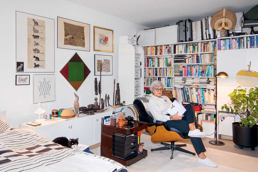
Rosmarie Tissi is a graphic designer based in Zurich. Following her studies at the School of Applied Arts in the same city, she went on to forge a long-standing career as one half of the renowned studio Odermatt & Tissi. Maintaining a partnership while working separately in each one's commissions, Tissi went on to become one of the most important female graphic designers of the 20th century. From posters to banknotes, from textbooks to typefaces, and from logos to complete visual identities, her work has spanned myriad fields and remains a source of inspiration for designers to this day. Tissi is a member of the AGI (Alliance Graphique Internationale) and ADC (Art Director's Club), and has exhibited and lectured widely around the world.
The Confederation grants Tissi a Swiss Grand Award for Design in recognition of the fundamental importance of her work and career, her trailblazing influence for female graphic designers, and her important contributions to the history of graphic design in the 20th century.
Rosmarie Tissi
© BAK / Marc Asekhame
Rosmarie Tissi
© BAK / Marc Asekhame

Rosmarie Tissi
© BAK / Marc Asekhame
Rosmarie Tissi
© BAK / Marc Asekhame
Rosmarie Tissi
© BAK / Marc Asekhame
Rosmarie Tissi
© BAK / Marc Asekhame
Rosmarie Tissi
© BAK / Marc Asekhame
Rosmarie Tissi
© BAK / Marc Asekhame
Rosmarie Tissi
© BAK / Marc Asekhame
Rosmarie Tissi
© BAK / Marc Asekhame
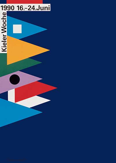
Kieler Woche 1990
© Rosmarie Tissi
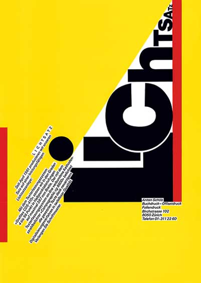
Lichtsatz Anton Schöb
© Rosmarie Tissi
[object Object]
© Rosmarie Tissi
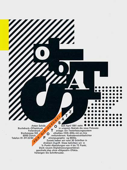
Photosatz Anton Schöb
© Rosmarie Tissi
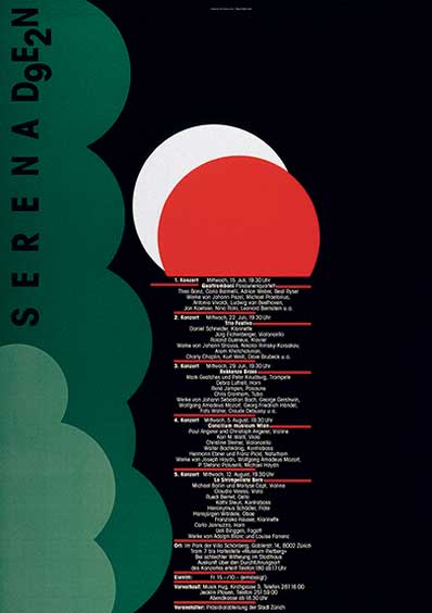
Serenaden 1992
© Rosmarie Tissi
Essay
The Art of Reduction
Few graphic artists of Rosmarie Tissi's (*1937) generation can look back on sixty years of similarly diversified and uninterrupted production. During that time, Tissi has created countless logos, corporate identities, customized typefaces, brochures, advertisements, prospectuses, packaging and much more. She was awarded the second prize in the 1989 competition for new Swiss bank notes. The posters she designed largely for cultural events play a special role in her oeuvre. She soon enjoyed international recognition, receiving prizes and showing her work in group and solo exhibitions. She is represented in numerous collections and museums in Europe, the United States and Japan.
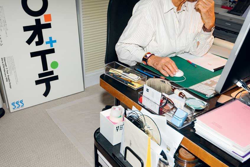
At the age of 19, Tissi laid the foundation for her career when she decided to break off her first apprenticeship at an uninspiring studio in Winterthur and contact Siegfried Odermatt in Zurich. Her models were the luminaries of a new, rational Swiss graphic design. In 1955 an exhibition at the Kunstgewerbemuseum Zurich and a special issue of the magazine Werk (No. 11, 1955) were dedicated to that movement; the self-taught graphic artist Odermatt was one of its leading representatives. Adhering to no school, he was acclaimed as an excellent teacher and an important champion of the new style. In 1968 Tissi and Odermatt founded O & T; it was to become a lifelong partnership.
How did this cooperative venture operate? The basic premise was the enthusiasm both designers had for clear, constructive graphic design, without bowing to the constraints of purist or puritanical dogmatism. In Odermatt's case, that meant a closer adherence to structure and grid; in Tissi's case, benefiting from the leeway for experiments and deviations. The layout of their studio at Schipfe in Zurich's old town symbolizes their working relationship: the studio runs through the attic at a right angle to the gabled roof - Odermatt faces the river, Tissi faces the Lindenhof. They are each busy with their own work. Between them, there is a table where the two strong personalities meet, discuss one another's work and engage in animated debate. The partner with more promising ideas or a less busy schedule handles the task. Shared projects are the exception. Once a year, Rosmarie Tissi turns her back on the small scale of the studio and travels the world - alone.
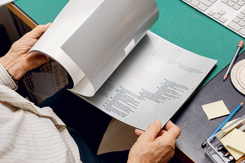
Her very first commission in 1956, a poster for the autumn fair in her hometown of Thayngen, already shows an astonishing cogency; its reduced typography in red, black and white clearly testifies to Tissi's unfailing eye for striking impact, distilled information and compelling combinatios of typeface and colour. Lettering as image in combination with marked colour contrasts is an enduring feature of Tissi's work. Around 1968, she begins toying with letters, taking them apart and reassembling them. She liberates them from their conventional rules, reducing them to their constituents and superimposing geometrical shapes with patches of colour. In her advertisements for the Belgium trade magazine TIPS (1968), she has letters somersaulting up and over each other and creates lettered imagery by playing with the negative and positive spaces within and between them. Later, she creates her own typefaces: Sinaloa (1972) has become part of the international Letraset programme. In Mindanao (1975) - based on letters made by folding paper - she emphasizes the physical aspect of lettering. Paper is not simply a flat surface: in 1969 Tissi was commissioned to design the logo and then later the corporate identity for the textile manufacturer Mettler & Co. The hatching in the M is reminiscent of the weave and folds of layers of fabric. The quality of the logo is made manifest in the brochure issued in 1970 to celebrate the 250th anniversary of the company: since the stripes have been punched out, the logo becomes visible layer by layer as the pages are turned. The company calendar of 1971 was also based on this principle. Tissi assigned a colour to each month and cropped the pages of the calendar so that the colour combination of logo changed successively in the course of the year.
Scissors and scalpel are still vital tools for Tissi. When the do-it-yourself graphic design of the youth movement was in full swing in the 1980s, she cut out the ragged right edge of newspapers and mounted them on a contrasting background, thus underscoring handcrafted spontaneity and even improvisation. Tissi applied this principle for the first time in 1979 for the cover and back of the Typografische Monatsblätter, and even more radically in her poster for the summer theatre of the city of Zurich in 1981, where the extensive programme is presented in "frayed" blocks of type radiating from the red evening sun on a dark green ground. It is not surprising that many O & T clients came from the printing industry and they proved to be particularly receptive to the design potential of experimental typography. A telling example is the advertising folder for the printer Druckerei Schöb in Zurich of 1982.
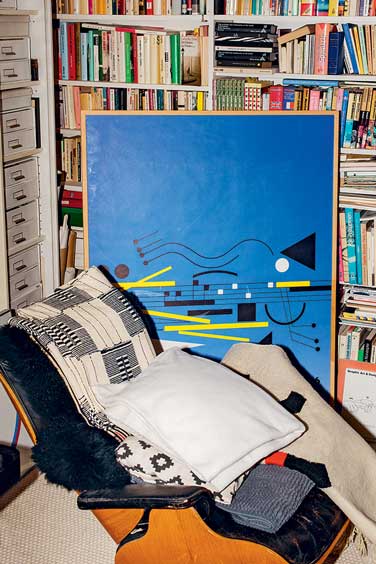
Tissi has always placed great emphasis on an economy a visual syntax. Having designed numerous logos, she has learned to restrict herself to essentials, to the core of a product, imaginatively capturing the essence of a company and communicating it in striking condensation. This capability persuades both customers and competition juries: the poster and appearance of the Kieler Woche 1990 is reduced to a simple motif: colourful pennants standing stiff in the wind. Whether in colour or in black-and-white, the pointed triangles can be easily adapted to the margins of diverse advertising formats without losing their appeal. It is also colouring, rhythm and condensation that subsequently define the posters for the annual serenade concerts of the city of Zurich, which at times resemble abstract compositions of colour, line and symbol, as if inspired by Kandinsky.
Rosmarie Tissi has made an inimitable contribution to Swiss graphic design. Her playful approach and her love of strong colour contrasts, of lettering and geometrical shapes are the ingredients of a lifetime career that has produced an oeuvre of undiminished freshness and originality through the decades, whereby the work produced between 1968 and 1990 is well worth revisiting.
Claudia Cattaneo