Essay
A Go-Between: Ralph Schraivogel and the Poster
A poster advertising snow tires shows a picture of snow tires. It’s a pity that Ralph Schraivogel never had the opportunity to design a poster for snow tires. What, one wonders, would it look like?
This question does not imply that Schraivogel is interested in disguising the subject of his work. On the contrary, he wants to make it visible — but without resorting to blatant mimesis. He asks: what does the subject matter mean, what is its visual potential and — once that’s defined — how can it be visually communicated ? Schraivogel is a go-between, much like a ferryman: the latter translates from one side of the river to the other and Schraivogel, the inner life of the subject into the visibility of the picture. That’s the key concern of visual design, and he tackles it with inimitable verve, producing work that has garnered many awards.
For well over 30 years the world has been richer for his posters. Rarely does their sophisticated subtlety betray the effort that went into them, and then only to the connoisseur. Some even make the impression of effortless aperçus although they, too, did not come out of nowhere. Let’s put it like this: if aperçus, then only in the wake of consistently revisited lucidity. A successful design is invariably the product of considerable trial and error along with intuition kept in check through self-critical control.
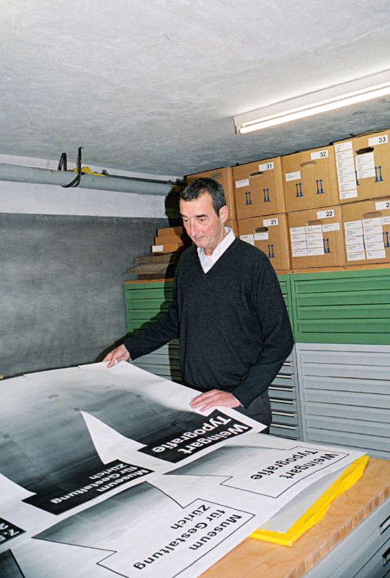
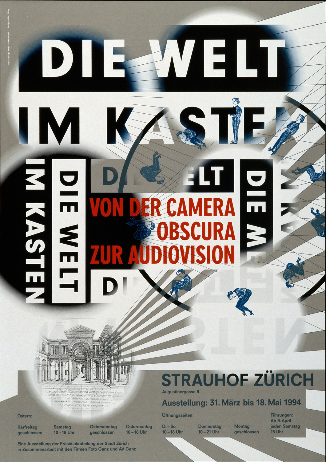
Let me try to pin down what it is that makes Schraivogel’s visual creations so distinctive with the exhibition poster Die Welt im Kasten (1994): “The World in a Box”, from camera obscura to audiovision, five hundred years of taking and making pictures, although the world is right in front of our eyes — one would think. ( This is the gravitational focus not only of this exhibition but of Ralph’s work as well. ) What does he do ? A modern street radiates from an architectural vanishing point of the Renaissance, assuming one chooses that particular reading of the light projected by a beamer — one can, but it’s not a must. The typographical elements of the poster are placed in an ordering framework, somewhat fragile in appearance and yet still governing the composition. Words and letters follow a course within that framework and parts of words are wiped out, due in part to the overall patches of dark and light. A fragmented stroboscope with a human figure doing a somersault is included in the precarious assemblage. The framework and its vulnerability: both are required in order to reveal the depth of field that marks the exhibition.
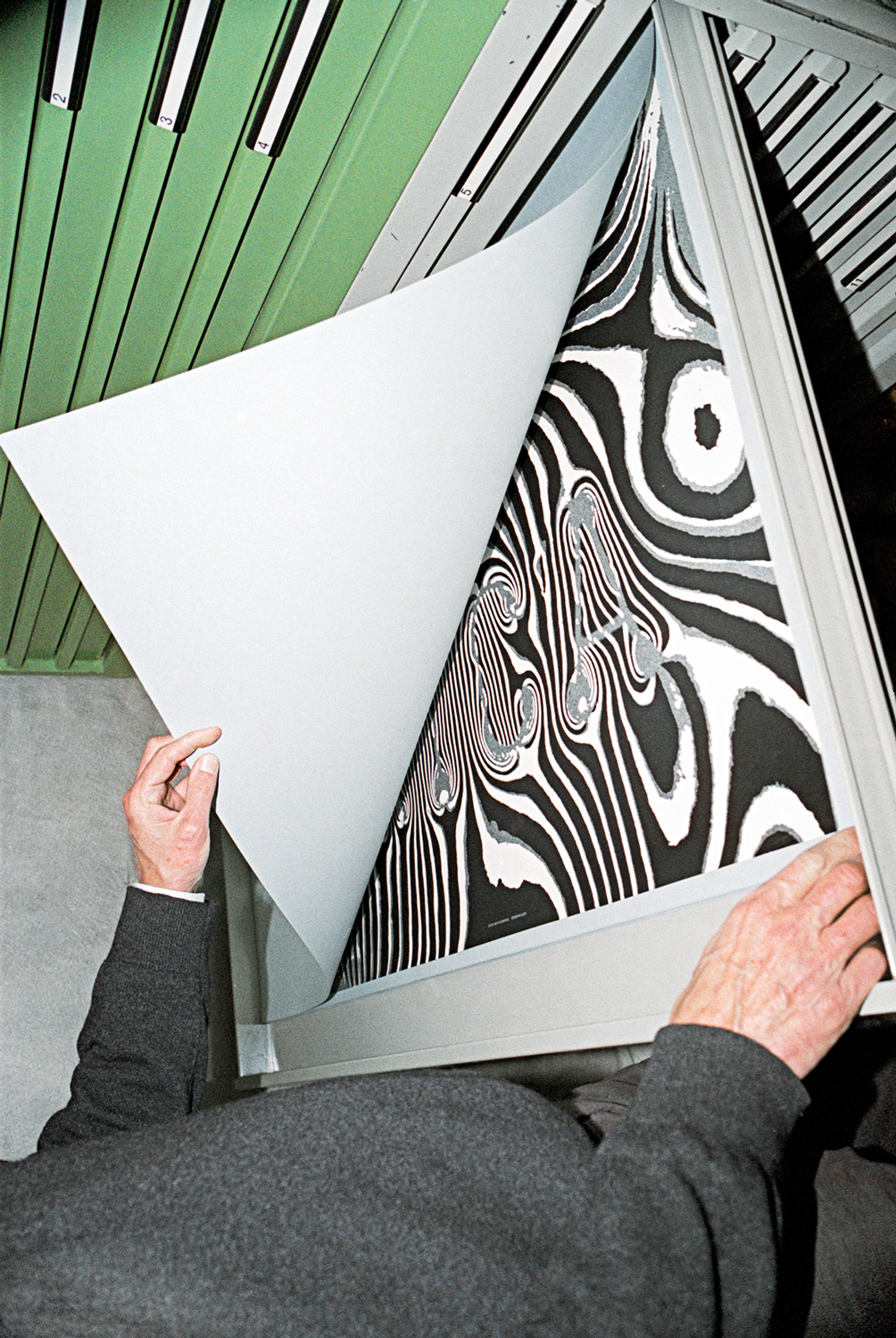
A sense of depth under or behind surfaces is characteristic of Schraivogel’s posters, which are never static, always in motion, much like the convection of air or water, layers of which rise and sink, and swap places. Obviously, his posters are only printed paper, but there are cases in which even the lettering seems to rise up out of the depths. The poster for the exhibition Gross & klein (“Big & small”, 1997) is indebted to the discovery that enlarging a scratched Plexiglas measuring stick on photo paper made it look as if we were gazing into outer space with the number 8 appearing as the symbol of infinity. This immanent third dimension gives Schraivogel’s posters a tangible solidity, which, until about the year 2000, was heightened by — but not based on — the technique of film montage.
It is the substance that fascinates this designer and not the technique. He does not deal in recipes. And that means constant expeditions in search of new forms of translation. In the poster for the retrospective of Akira Kurosawa’s work at the Filmpodium Zurich in 2005, the lettering is like origami and glossy in contrast to the mat background photograph of riders. Schraivogel has not ‘folded’ the individual letters as types but instead addresses the principle of folding itself. The letter ‘A’ occurs four times and is different each time. It is as if the third dimension required to fold the paper were really there. Decisions of that nature — presumably myriad, invariably different decisions — are no doubt the lonely business of the artist. And when the decisions are right, the posters radiate excitement and vibrancy.
The diagonal in the poster for the Woody Allen retrospective could be interpreted as Broadway, evoking associations with a special protagonist, the urban neurotic, or Manhattan. But only the filmmaker is explicitly named : Woody Allen. All else is conjecture, implication, energizing the poster with its… its what? Its message? No, that is not Schraivogel; that would be too one-dimensional. Instead: an atmosphere, a mood… He always finds the right substance with which to vaccinate his posters with effective results that unfold undercover. And we realize that every task, philosophically speaking, is initially a problem of knowledge.
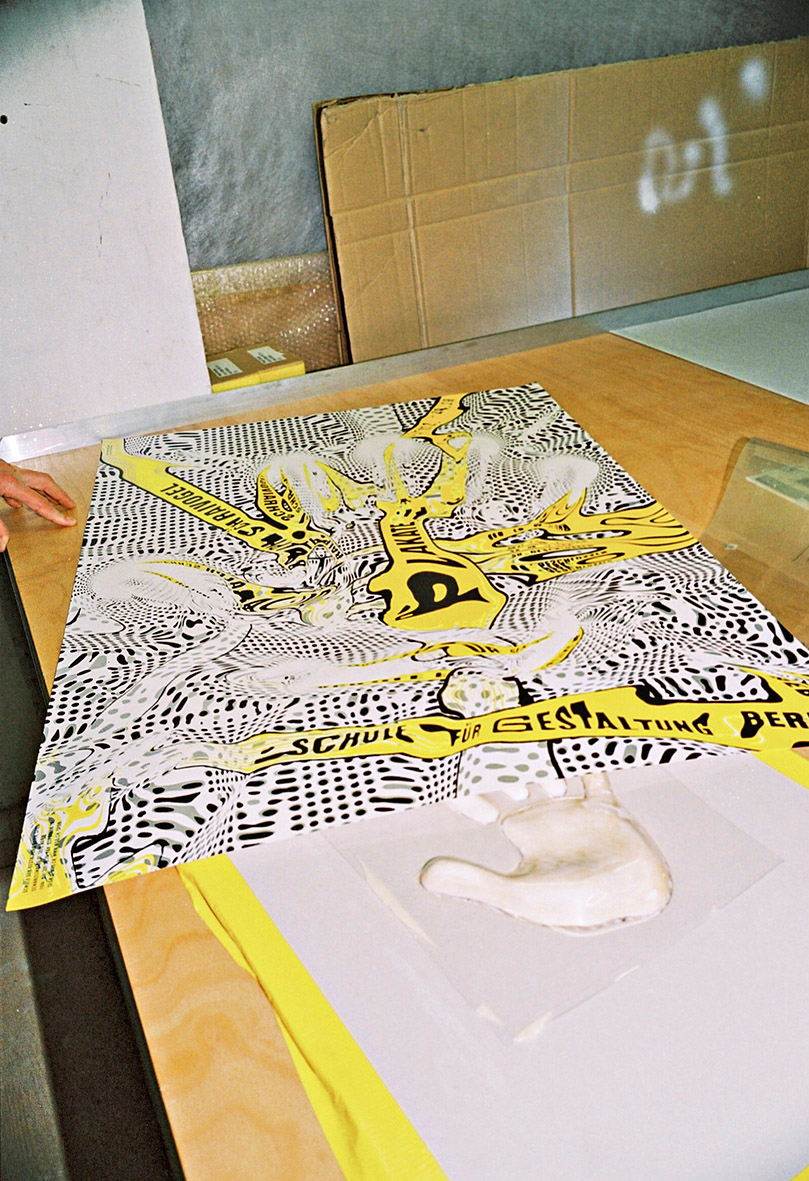
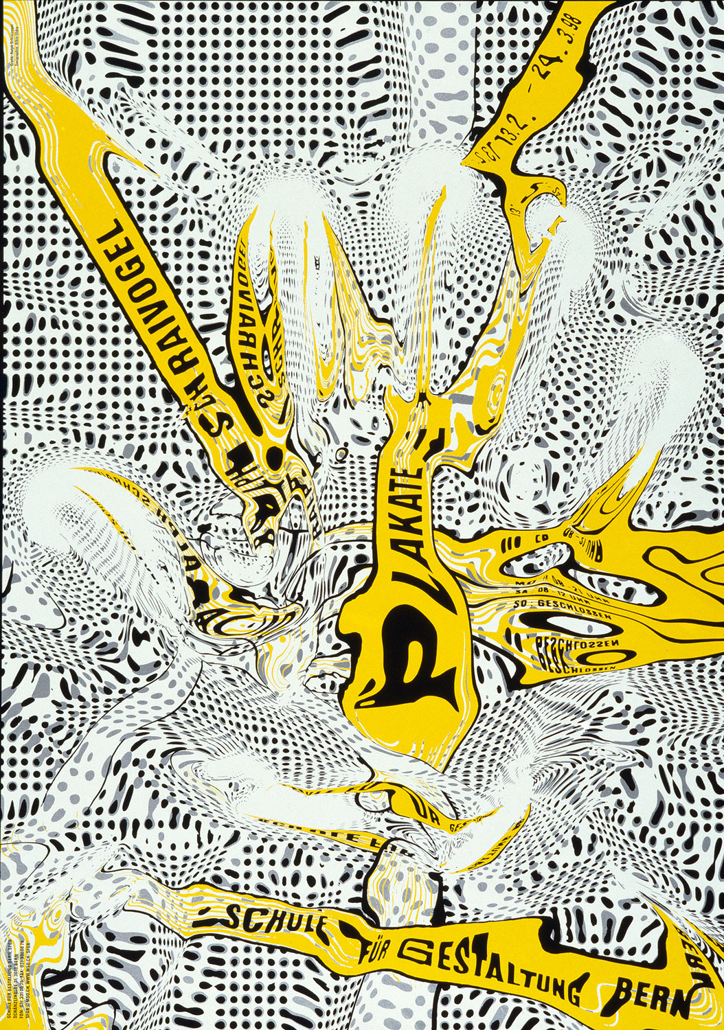
As a dyslexic, Ralph Schraivogel had to force himself to ‘like letters’ when designing a poster. That is why he counts the words, examines their shape, breaks them down into letters and ushers them to their seats, as in the theatre. It is a formal procedure and not a linguistic routine. He strikes a chord when he says: “I am interested in pictures when language doesn’t work anymore.” Because — we might add — language is a lumbering ( discursive-linear ) means of expression and a picture is immediate, its impact simultaneously perceptible as a whole. For visual designers, pictures, typography included, are the locus of their active agents — and their artistry lies in what they do with them and how.
Claude Lichtenstein