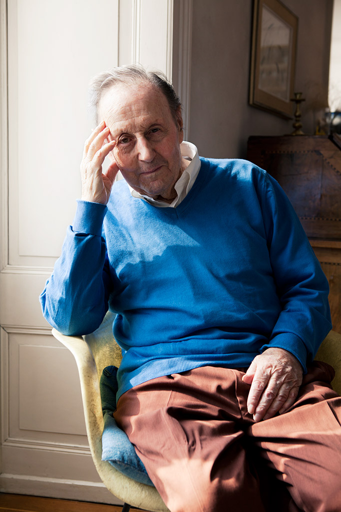
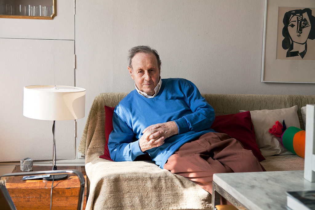
Armin Hofmann, 1920
Graphic designer and educator, Lucerne
By awarding the Grand Prix Design to Armin Hofmann, the Swiss Confederation pays tribute to a distinguished exponent of Swiss graphic design as well as a teacher and educator who was deeply influential on generations of graphic designers and teachers both in Switzerland and abroad.
Graphic designer and teacher Armin Hofmann does not fit easily into any category – and certainly not the Swiss Style drawer in which he is often wrongly placed. 'I was never impressed by the Concrete movement', he said ten years ago at an exhibition of his poster works held at the Museum für Gestaltung Zürich. Interestingly, however, his visual vocabulary does indeed have features in common with the Concrete style developed in the 1950s by Max Bill, Richard Paul Lohse and Josef Müller-Brockmann. For example, he evinces a preference for sans-serif fonts, grid-based design, the use of typography as an essential design element, and a preference for photography rather than drawings or illustrations. And certain parallels also exist in Hofmann’s radical approach to form and colour.
What truly distinguishes Hofmann from the Concrete is his artistic posture: he rejects all dogmatism, and stands apart through his own open way of thinking and creating. Hofmann was constantly evolving, both personally and professionally. In contrast to the approach taken by the Constructivists, most of Hofmann’s posters allow a symbolic interpretation – the image of a laughing clown (for the 1960/61 season at the Stadttheater in Basel), for example, or his famous William Tell poster of 1963 which rejects the clichéd Alpine romanticism and features an apple in black and white and the word 'Tell' in a strange new typography. Is this Hofmann’s image of modern Switzerland? Each of his designs explores the possibilities inherent in visual communication and calls them into question. This applies not only to the various posters he produced for cultural institutions in Basel, such as the Gewerbemuseum, Stadttheater and Kunsthalle, but also to his 'Kunst am Bau' projects, as well as the image/word logo used for Expo 64, the Swiss national exhibition in Lausanne.
What he demanded of himself, he also expected of the public: submitting to a reflective, didactic process rather than blindly trusting in accepted formulas. He took his audience seriously rather than serving up light, superficial fare. Hofmann risked creating confusion with his sometimes unusually constructed typefaces, and his poster for the 1954 exhibition 'die gute form' is a clear example of this. Rather than featuring objects, he decided to use letter forms as design elements: geometrically precise and in harmony, yet, as the forms are clipped and not immediately readable, still abstract and unconventional. (His commonly used combination of black and white also represented a kind of opposition to the colourful panorama then common. The effect was that black and white called one’s attention more quickly.) The exhibition’s content could hardly have been summed up more precisely: the poster, with its typography and composition, presents the topic itself at a meta-level. The work also exemplifies something else: the starting point for Hofmann’s graphic solutions was always the content, the degree to which he dedicated himself would be hardly imaginable in today’s age of strict time management.
Hofmann’s method of teaching design and his impartiality made him an ideal teacher. He influenced generations of students in Switzerland and abroad, particularly in the United States, the United Kingdom and even in India. Hofmann was one of the teachers for whom teaching was as important as his own projects. He made little distinction between the two, since he never took a strictly one-sided view of his pedagogical work. In other words, it was not just that the students were learning from him – he was also open to being inspired by them. 'Designing also means being aware of your ethical responsibilities', was one of Hofmann’s messages for the younger generation. He believed that the more complex the environment became, the more minimal and clear the design should be. It is an idea that would appear to be more relevant than ever, and it illustrates the influence Armin Hofmann’s approach still has today.
Katharina Altemeie