
About the awarded year
Moderns and modernists
"But ... this book isn't modernist, it's modern!" I have retained this exclamation. which burst out during the jury's debates on "the most beautiful Swiss books" held in the newly renovated building of the National Library and the Federal Office of Culture, as it is indicative of some of the themes that occupied the jury during its three-day session last January. But why not, in fact, once again take this modernism and its current interest as a red thread?
Thus the Jan Tschichold Prize. awarded this year to Lars Müller. can be seen in this perspective of linkage to the "moderns" for a twofold reason: first, it has been given to a publisher whose catalogue has allowed the youngest generation of designers, in Switzerland and elsewhere, to have at their disposal some of the founding works of modern design, published with the highest degree of qualitative concern at the technological and editing level. Secondly, it has also been given to a designer of books who by his accomplishment has proposed a personal updating and a living development of the modernistic tradition: both by virtue of his visual language as well as his rational approach to questions of visual design. It is not immaterial to emphasize that this approach was made at the very moment when these languages seemed to have reached their limits. namely at the end of the 1980s.
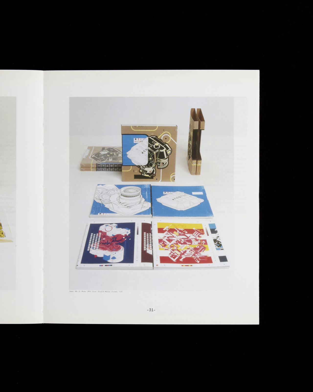
The distinction "Book of the Jury" was awarded to the book "Woodtli". Would it be out of place for us to indicate that we're up to date by noting that the ephemeral trends of the techno scene in the 1990s here find a new stage of their development in the media of the book? The flyer-to-book transfer, the unique project of Martin Woodtli, invites the reader to explore a new materiality of the printed medium. It has led him to experiment with a process that mixes a great number of samples of "techno" visual jargons: layers of vectorial designs, graphic parodies and self-quoting word games. If the computer screen has become the almost obligatory intermediary tool of the graphic project, here it appears well challenged by the high-resolution potentialities of the printed medium.
Again, the topic of modernism permits us to draw a parallel between "scholarly" or "purist" typographical cultures using voluntarily restricted and universalistic graphical means such as the work designed by Weiersmüller Bosshard Grüninger WBG dedicated to Rolf Schroeter, and typographical cultures that open these same abilities up to visual cultures that are "local" and of very diverse contexts. such as the series of printed materials of the Zurich Schauspielhaus theatre designed by Urs Lehni and Cornel Windlin.
Another aspect of our modernity is the internationalization of the links that define publishing projects at all their stages. This is what led the jury, this year, to accept books that do not combine two of the three conditions required for being accepted as "Swiss books" according to the regulations of the competition, namely: a Swiss designer, a Swiss publisher and a Swiss printer. By doing so, the jury has accepted the fact that in the context of increasing internationalization, some books may exceed these regulations, which govern the majority of "national" competitions. Up to now, these rules have excluded a group of particularly international books. The jury will recommend to the Federal Department of Home Affairs that, in future, eligibility should be extended to books that fulfil at least one of the three above-mentioned criteria and demonstrate a particular, specific connection with the Swiss book scene in terms of design, printing or publisher’s conception.
On this principle, the jury accepted three books. The first, “Woodtli” by Martin Woodtli, belongs to the Swiss graphic design scene by virtue of its author, its target audience and the commissioners. The second is the “Neue Zürcher Evangelien-Synopse” , whose Dutch designer, Christoph Noordzij, also a designer of typographical characters, forms the link between the typographical culture developed under the aegis of the Royal Academy of The Hague, and a publisher and proofreaders’ department that is very specifically of Zurich. Seeming to revivify the long history of the patterns of the Reformed book, it actually offers its readers highly innovative formal and textual solutions. Thirdly, the book “Design Noir" is also based on similar connections: it is co-published in Switzerland, and its designer, Alex Rich, is French. Developing an empirical and humoristic approach, it belongs to the networks that criss-cross the youngest sector of the Swiss graphic design scene.
The majority of the books submitted to the competition are illustrated works, particularly of photography, whose technical qualities of reproduction together with the quality of their design are to be pointed out, such as the book from the publishing house of Codax dedicated to the photography of Shirana Shabazi, which continues a collection that had already been awarded a prize and therefore was not eligible. Although in the minority among the books received, several books of text were awarded a prize: these testify to a great concern for microtypographical detail, an example being the works published by the Mühlberg Studio. (May we risk a remark here? This microtypographical culture is curiously missing from several books coming from French-speaking Switzerland which nevertheless exhibit a very resolute quality of production as far as their pictures are concerned. Several projects can be mentioned which are distinguished for their typographical design, also comprising the typographical character of the title’s design or even of the book’s text ("Neue Zürcher Evangelien- Synopse” and “Across /Art /Suisse /1975-2000” , for example).
If, as we have seen, the designation “Swiss” has undergone some extension, the term “beautiful” will undoubtedly continue to remain necessary, at least in the sense that it will permit the federation of the qualitative references of the participants in the competition, who - and this is the most pleasant part of the game, to participate in or to judge - are becoming more and more diversified and manifold.
François Rappo
Graphic designer and typographer. Lausanne
Chair of the Jury
Jury
Chair
François Rappo, Graphiste et typographe, Lausanne
Patrick Frey, Verleger, Autor, Schauspieler, Zürich
Ursula Hiestand, Grafikerin, Zollikon
Karel Martens, Buchgestalter, Arnhem, NL
David Rust, Graphiste, Lausanne
Susanna Stammbach, Typografische Gestalterin, Basel
Albin Uldry, Serigraf, Hinterkappelen