The Good Life. A Guided Visit to the Houses of Modernity
Redesign and Timelessness
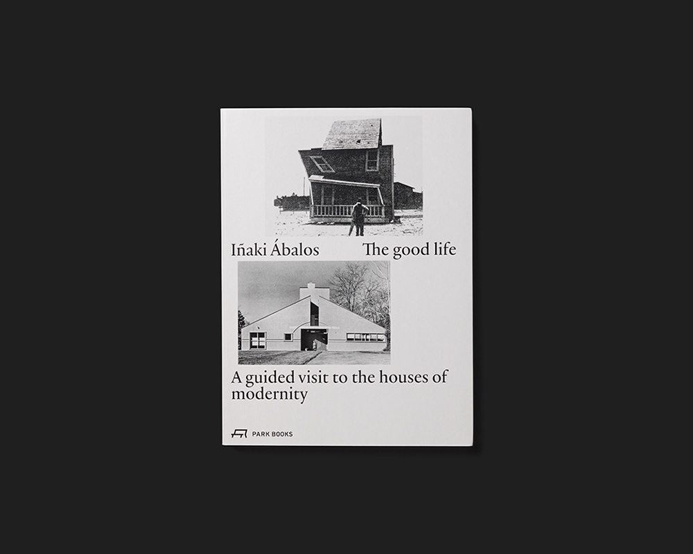
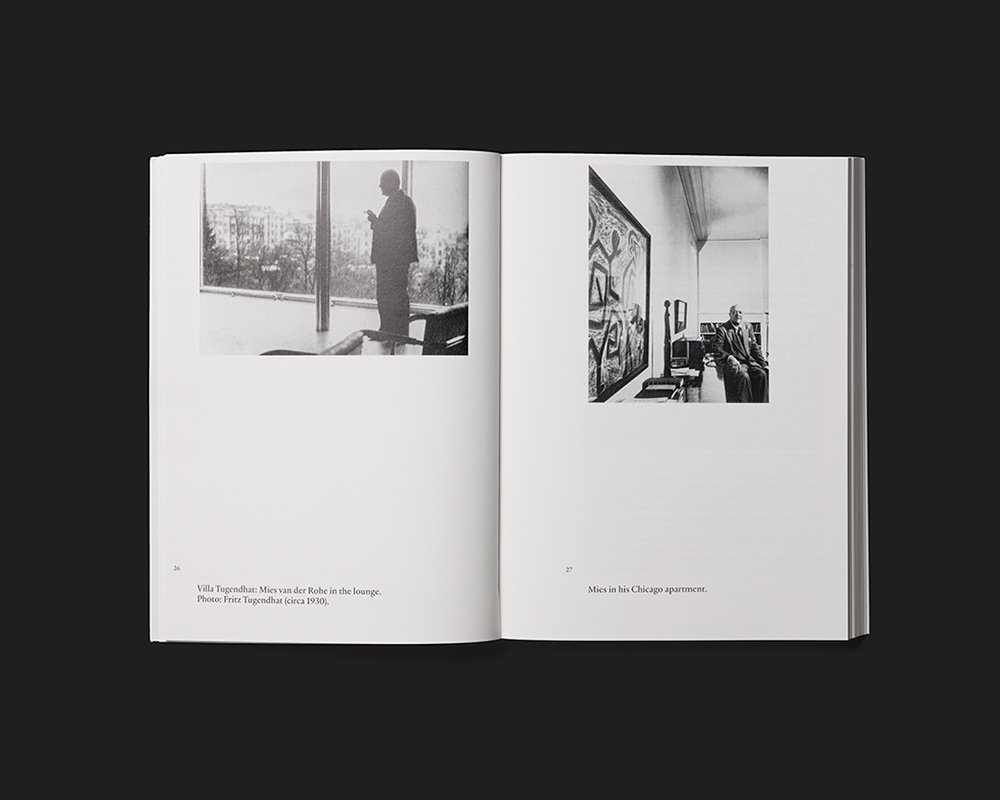
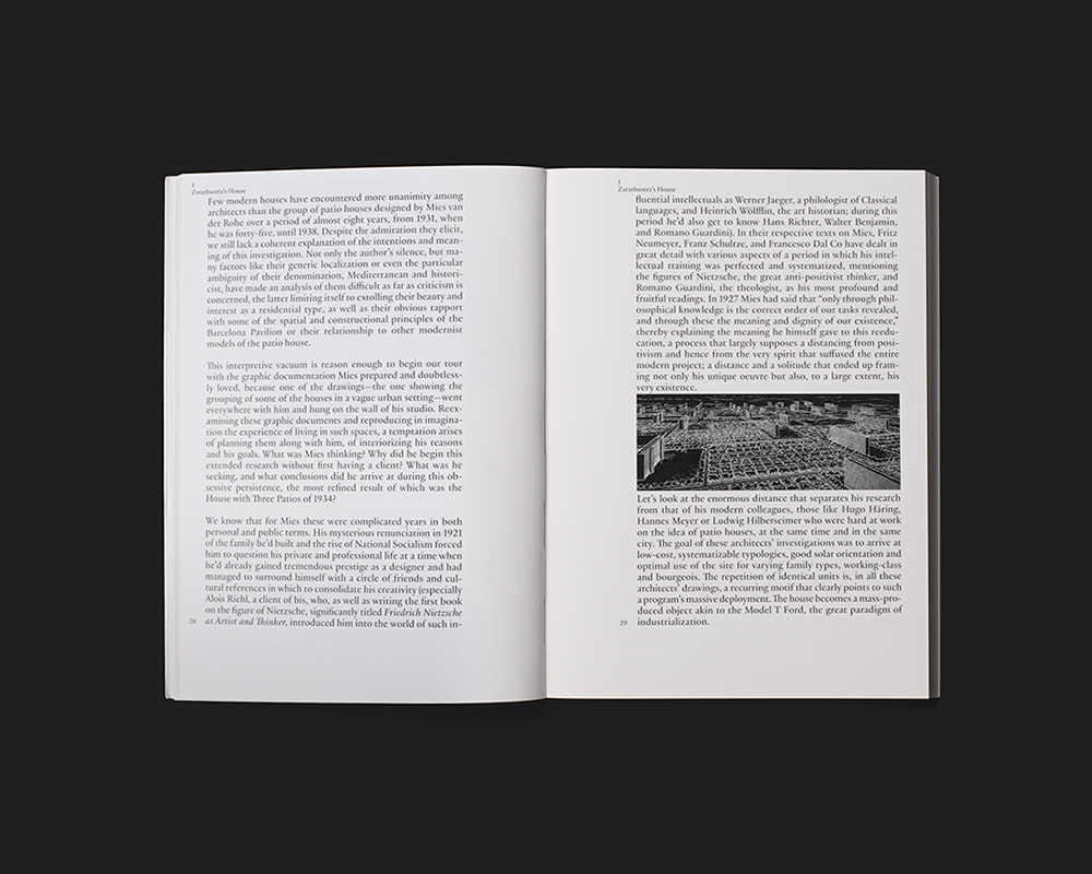
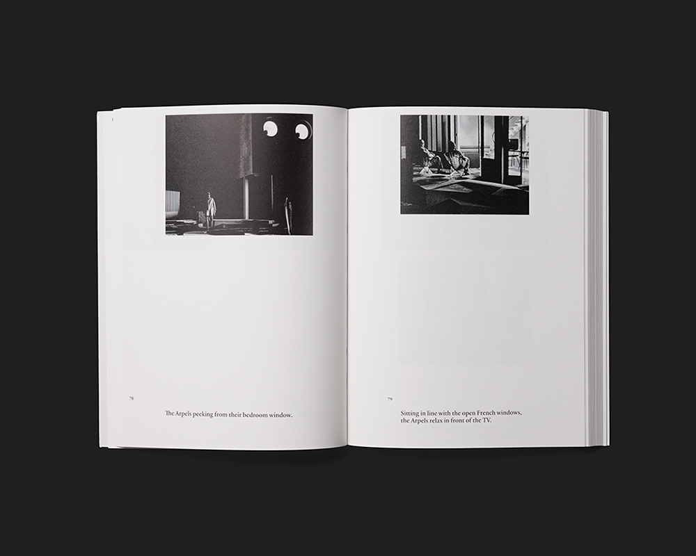
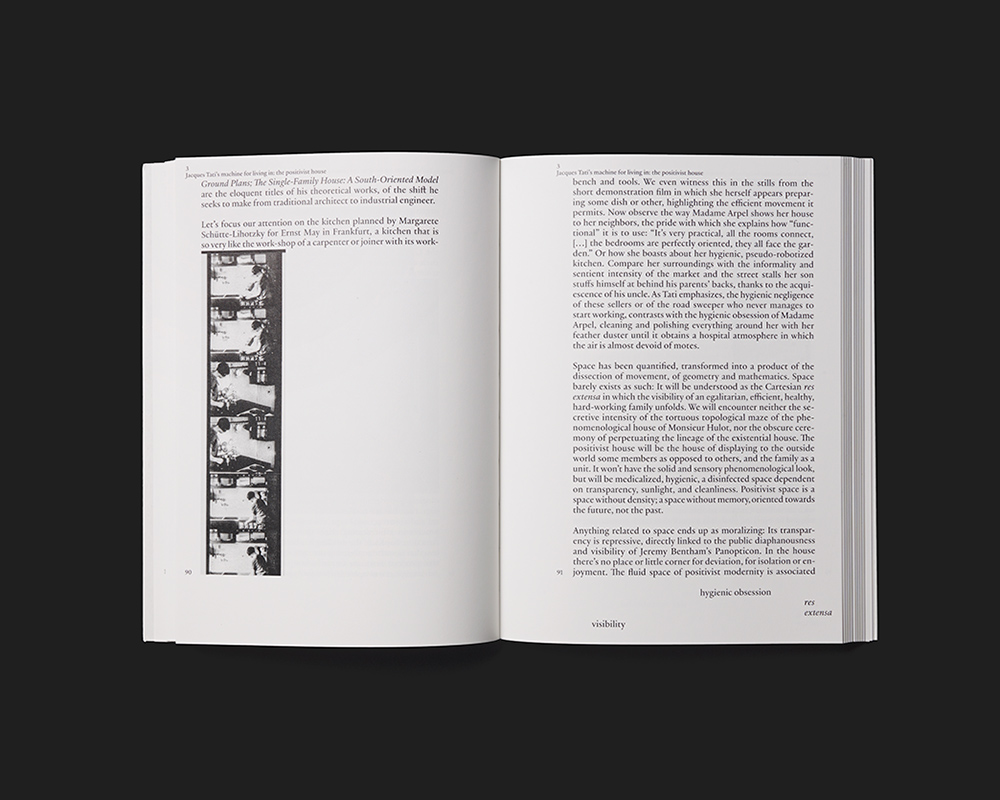
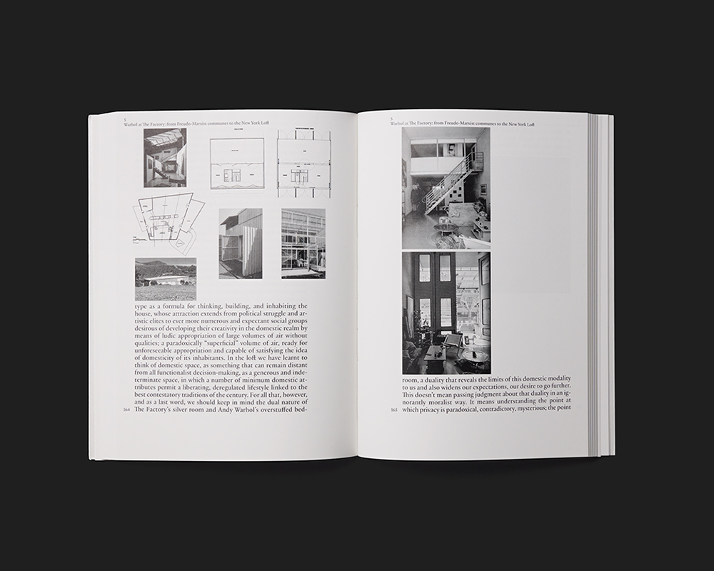
The illustrated analysis of seven real and fictional houses from the twentieth century published by the Spanish architect Iñaki Ábalos in 2001 reappears in a new edition with a fresh design. The stylistic means are explicitly contemporary – reduction to black and white, softcover with two images and page-size flaps, single-column main text in a relatively large font, and so on – but in this case they serve to underscore the work’s continuing relevance, indeed timelessness. The relatively small format is pleasingly modest for an architectural book. The chapters begin with a typographical title page followed by a number of large pictures, each on one page, and then the text. Smaller images aligned to the left are inserted into the type area in the middle of the paragraphs and sometimes in the middle of a sentence, so that they appear as integral parts of the whole. Chapter numbers and titles in the header, together with page numbers and one to four keywords at the bottom edge, frame each page and also provide a navigation system. The overall impression is light, elegant and attractive.


